Redesigning the Article Page for Work | UX/UI
From Digital Deluge to Deliberate Design: How UX Principles Combat Media Clutter
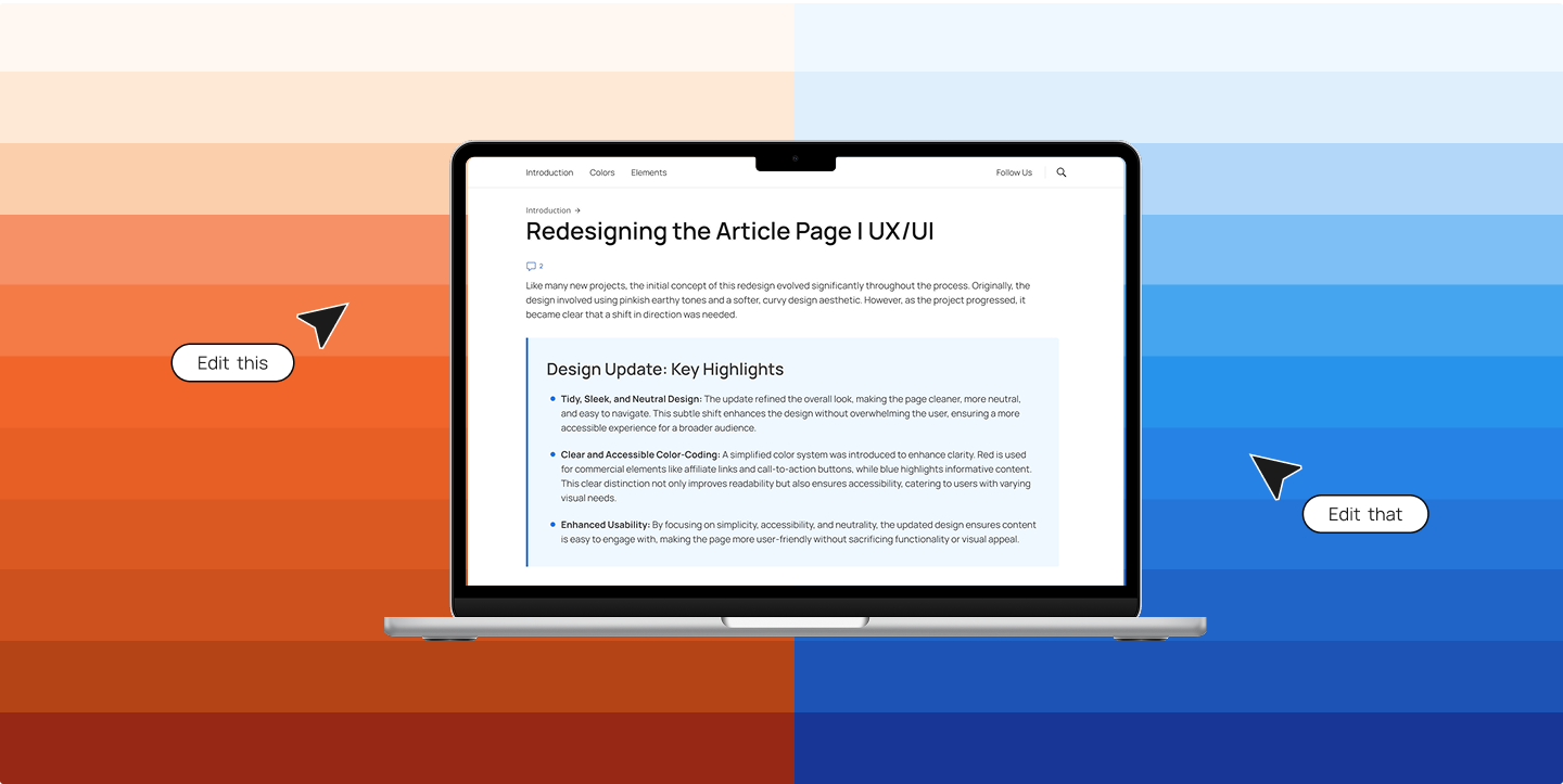
In a recent role, I contributed to a major redesign of a content-heavy news website. The existing article page layout was inherited from a broader template with minimal branding and dated design patterns. My goal was to reshape it into a more focused, branded, and user-centered experience.
When it comes to written content online, digital tidiness is essential. Ever scroll through an article and feel a creeping sense of overwhelm? Pop-ups, notifications, ads blinking at the edge of your screen—plus a wall of dense text. This isn’t just annoying; it’s the reality of media clutter—the overload of visual and cognitive stimuli we encounter daily.
As a UX/UI-focused web specialist, I’ve had the opportunity to address this head-on. What started as a visual refresh quickly became a deeper exploration of how thoughtful UX decisions can cut through digital noise and help users stay engaged.
The Challenge: When Design Adds to the Noise
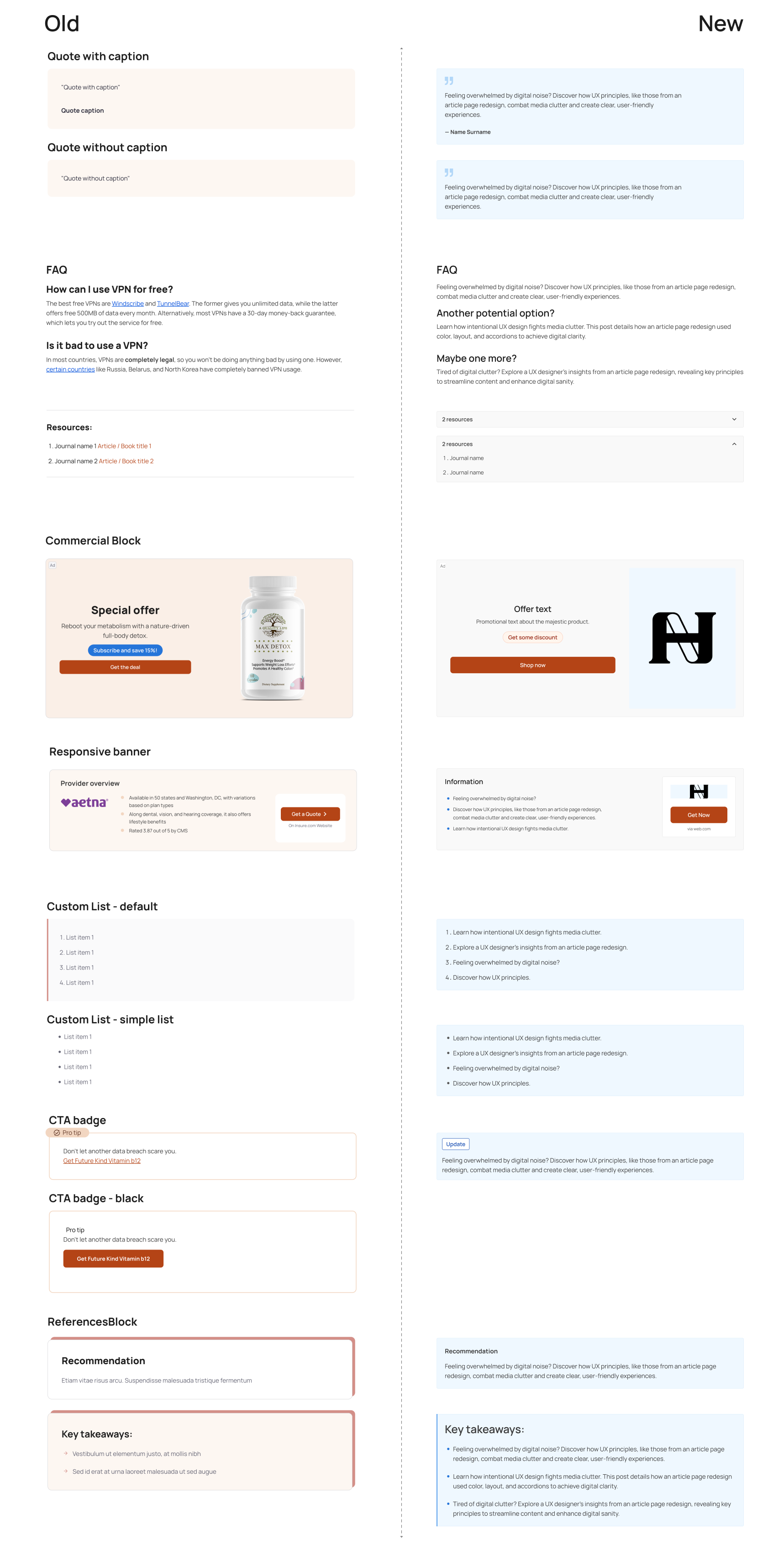
The original article design leaned into “pinkish earthy tones and a soft, curvy aesthetic.” While visually interesting, the result was a page that felt busy and harder to navigate—particularly in an already noisy digital landscape.
Example of the old color scheme:
To improve clarity, we shifted toward a cleaner, more neutral design with modern typography and streamlined visuals. This subtle evolution enhanced the layout while keeping the user experience front and center.
Our goal: a clear, navigable interface that wouldn’t overwhelm—ideal for skimming or deep reading alike.
On Design Extremes, Brain Whispers, and Amazon
When people talk about design, the conversation often swings wildly between extremes.
On one side, you’re bombarded—colors flashing, pop-ups dancing, animations whizzing by like fireworks. It’s as if the internet is trying to inject fabricated excitement straight into your retinas.
On the other side, you’ll find pure minimalism: monochrome grids, airy whitespace, and text that whispers instead of shouts. While clean, this too can feel… sterile. Bland. Predictable.
I don’t believe there’s a single “right” way to do design. There’s no universal recipe. What I have noticed, though, again and again throughout my career, is this:
What truly makes something feel good—makes it pop without screaming—is attention to detail.
Not the flashy kind. The quiet, persistent kind.
These are the elements so small they’re often dismissed:
“That corner radius is barely off—no one will notice.”
“This shade is close enough.”
“Spacing looks fine, right?”
But your brain notices. Even if you can’t put your finger on it, it knows something’s… off. It nags you with the low-grade discomfort of visual inconsistency. Maybe it’s a misaligned element. Maybe a font weight that’s one degree too heavy. You won’t consciously complain—but you won’t quite relax either.
If you’re looking for proof, look at Amazon.
The site feels visually outdated. But when you examine its evolution, you see a Darwinian design path: no flashy reboots—just slow, consistent iteration. Every change is intentional, tested, and context-aware. It’s a living organism, shaped by user behavior and feedback, not passing trends.
That’s what good design often looks like in the wild: not perfection, not minimalism, but a thousand tiny details quietly doing their job.
Designing for Sanity: Key UX Principles in Action
The Unsung Hero: Rational Typography
Typography is often undervalued in commercial content, where imagery tends to take center stage. But type is powerful. We refined the type system with clear hierarchy, generous line spacing, and rational font pairings to reduce cognitive load and guide the reader naturally through the page.
Color-Coding with Purpose
Clutter isn’t always visual—it’s often cognitive. To reduce mental effort, we introduced a color-coding system that clearly differentiates content types:
Red for Commercial Elements
Affiliate links, CTA buttons, and promotional content use shades of red to distinguish them from editorial elements.
Blue for Informational Content
Highlights and factual information are styled with blue to subtly signal relevance and importance.
This separation of content types helps the reader quickly scan and prioritize, improving usability and accessibility.
Visual Breaks & Layout: Let the Eye Breathe
With attention spans shrinking, a dense wall of content just doesn’t work. The new design embraces minimalism, clear content blocks, and strategically placed images that give the eye places to rest.
This structure encourages scanning, and makes sure that the most important information surfaces first.
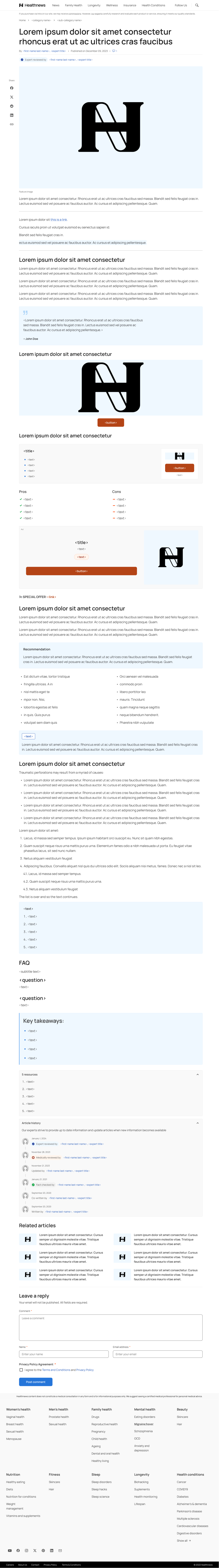
Accordions: Progressive Disclosure FTW
Not everything needs to be visible all at once. We introduced accordions to manage dense information, allowing readers to expand only what they care about. This reduces visual clutter and gives users more control over how they engage with content.
Header Simplification: Making Every Pixel Count
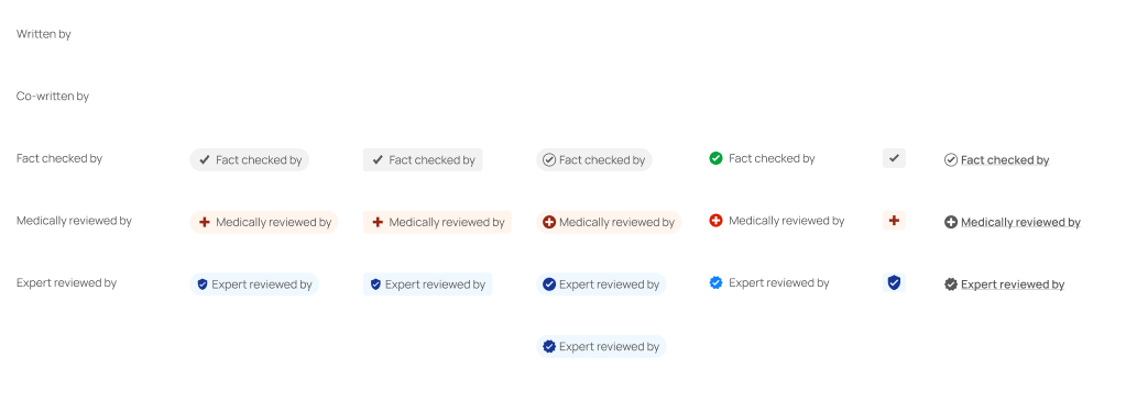
The author section and header were key real estate. Originally overloaded with elements like large author photos and redundant details, they distracted from the content.
Solution: Move author images to a collapsible Author History section, and streamline the top area for breathing room and focus.
A prieview of old elemens vs. new one’s:
Final Thoughts: Design as Digital Hygiene
Redesigning this article page reinforced a key belief: UX is not about making things pretty—it’s about making them purposeful.
We can’t control how noisy the web is, but we can design better experiences within our own corners of it. Thoughtful spacing, color usage, and interactivity help users focus—and in a cluttered world, that’s powerful.
- Are notifications serving you or overwhelming you?
- Is the information presented clearly, or are you forced to hunt for it?
- Does the layout support focus—or steal it?
By recognizing the symptoms of designed clutter, we become more intentional creators and consumers. Design is not neutral. And clarity, in both code and content, is an act of care.